
Tuesday, 16 February 2016
Tuesday, 9 February 2016
Monday, 8 February 2016
Chinese watercolour panting
What are Chinese watercolours?
Chinese watercolours was a popular style of art from China. This started around 4000 B.C. and was developed continuously over a period of more than six thousand years. This came to a point in time where flowers,birds and,other animals were very popular to paint. There is six principles in Chinese watercolour.
1.Spirit Resonance which refers to the flow of energy that encompasses theme, work, and artist.
2.Bone Method, or the way of using the brush, refers not only to texture and brush stroke, but to the close link between handwriting and personality.
3.Correspondence to the Object, or the depicting of form, which would include shape and line
and many others.
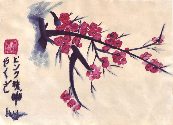
There is four seasons paintings and this photo above is one of them. This is a Plum Blossom and this represents the winter, orchid is for the spring, bamboo for the summer and chrysanthemum is for autumn. All of these styles are done on many materials such as rice paper and maybe even bark. Traditionally you would use a brush made out of bamboo with wolf fur.
And that is what Chinese watercolour is.
Monday, 19 January 2015

Sunday, 18 January 2015
Friday, 9 January 2015
369
Wednesday, 29 October 2014
Nintendo

For this assignment I chose a Nintendo controller. This symbols how I always love video games. Then I notice that its part of my life.

In this assignment we had to outline an object using the pen tool in illustrator. Then we had to colour it after. At the start I decide to do a camera but then I notice that the camera was to difficult for me to do. So then I did the Nintendo controller because it was a lot easier. After that I had to colour it so I went with some easy colours. But I had to make them have contrast. So I made some colours darker then others. We had to make seven colored versions as well a black and white and a gray scale. The black and white was one of the easier ones because I just had to make the out line white and make the inside black.


Out of all of the out lines I think that this one is my favorite because its looks like the original. So I'm very happy how it turned out. This was my first time using illustrator and I thought that it was a pretty fun time.
Subscribe to:
Posts (Atom)